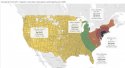
Find this chart prepared by marketing/household data guru Justin Hart remarkable telling.
About 45% of COVID-19 deaths in the US were from the 45 counties within 100 miles of NYC, despite those counties having only about 10% of the US population.
More than half (about 55%) of COVID-19 deaths in the US were from the 175 counties within 250 miles of NYC, despite those counties having less than 20% of the US population.
The combined COVID-19 death rate in the 45 counties within 100 miles of NYC (which are home to about 10% of the US population) was about
1,700 deaths per 1 million people—a rate far worse than any single country in the world:
Coronavirus Update (Live): 10,000,578 Cases and 498,954 Deaths from COVID-19 Virus Pandemic - Worldometer
The combined COVID-19 death rate in the 1,436 counties more than 250 miles from NYC (which are home to about 80 % of the US population and include all of the counties in states that didn’t lockdown, didn’t issue stay at home orders, didn’t limit religious gatherings, and reopened in April) was about
219 deaths per 1 million people—interestingly that’s about the same as the rates for Canada and Mexico.
Coronavirus Update (Live): 10,000,578 Cases and 498,954 Deaths from COVID-19 Virus Pandemic - Worldometer