**Q&A ONLY** Ask the MODERATORS your Forum Questions **NO DISCUSSION**

DNA Solves
DNA Solves
DNA Solves
Status
Not open for further replies.
attachment.php
Thank you so much! I've seen the exact "Post New Thread" lozenge button on other pages, but on these major threads this is what the forum looks like for me...
 

Attachments

  • Screen Shot 2016-09-14 at 2.38.57 PM.jpg
    Screen Shot 2016-09-14 at 2.38.57 PM.jpg
    102.6 KB · Views: 240
Since the system upgrade, my space bar only works sporadically when replying to posts. It only happens on WS. A few other posters in the Cooper Harris trial thread have mentioned this same glitch. Thank you.
 
For how long will the search feature be impaired?
 
Since the system upgrade, my space bar only works sporadically when replying to posts. It only happens on WS. A few other posters in the Cooper Harris trial thread have mentioned this same glitch. Thank you.

Are you using an Apple product?
 
Wfgodot your concern is better addressed via the alert system.
 
Hello, has the forum skin changed? I now have ads on the side of my threads, as well as the top. Here's a picture.
View attachment 104443

Also, I would like to change my screen name, I have become aware from this election that the # 88 is a Hitler acknowledgement, don't want that. I actually chose 8 as it is a good luck number in the Chinese culture.

Thank you
 
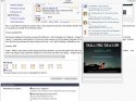
Hello, has the forum skin changed? I now adds on the of my threads, as well as the top. Here's a picture.
attachment.php


Also, I would like to change my screen name, I have become aware from this election that the # 88 is a Hitler acknowledgement, don't want that. I actually chose 8 as it is a good luck number in the Chinese culture.

Thank you

My screen changed to the same as yours this afternoon. I find it tolerable, but cluttered. It looks too much like Facebook pages, which I do not use often for that reason. I personally would prefer to not have so many columns on all the pages if possible. Do we really need the left column with settings on every page? I believe all of that can be accessed via other buttons at the top... am I right? (settings, notifications, etc).

Anyway, JMO

ETA:
(have to add this last because I cannot go back and edit.... and cannot see to insert it where it belongs). :

I added two screen shots of what my edit page looks like. It is the ENTIRE page of the forum, I think. No clue where that came from. FWIW, I am on an iPad.)

Yikes! When I came here to edit my post and add a sentence, my post was split in two with a HUGE image of the original poster's screen shot in the middle .... and what I am typing is way outside the margins so I can't even see what I am typing. Forgive any typos
 

Attachments

  • IMG_0423.jpg
    IMG_0423.jpg
    134 KB · Views: 24
  • IMG_0424.jpg
    IMG_0424.jpg
    115.8 KB · Views: 21
Mine went wonky too! Now I have ads running down the right half of the page and the posts are on the left half. I don't like it. :(
 
Hi Everyone,

When I became sole owner and we made changes with vBulletin some of our members did not have the latest vBulletin standard skin. We left it that way because at the time it didn't make a difference.

Now, everyone has to have the same look on their Websleuths page. We can't have a few people here and there not have the same thing as everyone else. It makes it impossible to make changes correctly.

All you are seeing is exactly what everyone else has been seeing for quite a while.

My apologies for not warning you in advance. Things are a bit hectic now with the A&E show premiering Saturday night.

If you have any questions you can post them here or send an email to websleuthscomments@gmail.com

Thank you,
Tricia
 
It's ok, Tricia. It was just an unexpected surprise. But this time I am not seeing the column with all the settings along the left, just the column of posts and on the right the boxes with misc. info. really prefer this two column view rather than three, so I hope this is the way it will stay ...... ? (I will survive, however it stays :tyou: )
 
While I understand and accept the nature of the changes, a page like New Posts is now so truncated that barely a half-dozen words are viewable on the thread title line. This is a drawback for those who attempt to devise informative titles. Many times, threads are rendered unidentifiable. Thus, this is especially a drawback for new users of the site.

And my question is -- could not a second line be added beneath? or the typeface made smaller to allow for more information? both?
Can you please tell me what machine you are using? Thank you.
 
I liked it without the right side column. My page always covered the entire page. I have had surgery on both eyes and have to have the large type in order to read.

The changes occurred this afternoon. Thank you in advance for anything that might could be done.
 
I liked it without the right side column. My page always covered the entire page. I have had surgery on both eyes and have to have the large type in order to read.

The changes occurred this afternoon. Thank you in advance for anything that might could be done.

I agree. My reading space on my screen for Websleuths is getting smaller and smaller. Big banner at top, then the ad line, then the big boxes for trending stuff, now the big bar on the right - makes for difficult reading on a smaller size laptop. It would be nice to have the option to turn off some of these big boxes for better reading experience...
 
Same here - also the posts are all centered! I guess we can't change it back to what we had earlier now?

darn....
 
image.png Thos is new posts on and ipad. Typing is completely gitchy and slow on iPhone and iPad

ETA it took half an hour to post this, but typing is much better on the edit screen, which tells me there's something odd going on. The typing issue is a delay between typing and the text showing in the text box.
 
Now my text box for replies pops out larger than the rest of the page sometimes. (using iPad).
 
Status
Not open for further replies.

Members online

Online statistics

Members online
151
Guests online
4,773
Total visitors
4,924

Forum statistics

Threads
602,878
Messages
18,148,191
Members
231,566
Latest member
LostKitty311
Back
Top